9/18/2023 Updated: Finished initial css2 notes writing.
CSS General
Genres of Stylesheets
- CSS Inline Stylesheets
<p style="color: green;font-size: 80px;"> |
- CSS Internal Stylesheets
The internal css style can be put anywhere, but we usually put it under <head>
<head> |
- CSS External Stylesheets
- The tag
<link>should be written in the tag<head> rel:it refers to relation to indicate the relation between the current file and the imported file.href:it refers to the address of the imported file.
- The tag
<!-- x.html --> |
/* x.css */ |
Stylesheet Priority
Inline Stylesheets > Internal Stylesheets = External Stylesheets
Inline StylesheetsandExternal Stylesheetshave same priority; The latter one will overwrite the former one- In the stylesheets, the effects are also based on the order of writtern.
Basic Structure
h1 { |
CSS Three Characteristics
- Cascading
- Inheriting
- Priority
CSS Normal Selector
Universal Selector
Select all of types to apply with the following styles.
* { |
Type Selector
Select a specific type of element to set with styles
/* Select All h1 */ |
Class Selector
Select elements based on their class to set with styles.
/* Select All elements with class "speak" */ |
- One element cannot write multiple
class; only oneclassis allowed.
<h1 class="speak" class="big">hello</h1> |
- But we can write multiple value separated with
spacein theclass
<h1 class="speak big">hello</h1> |
ID Selector
Select element based on its id explicitly to set with styles.
/* Select the Element with id "apple" */ |
idis consist of characters, numbers, underlines, hyphen; use character as the begainning instead of space.- One element can only have one
id, and multiple elements cannot have sameid. - One element can have
idandclassat the same time.
CSS Compound Selector
Intersection Selector
Choose those elements fulfilling all conditions.
/* Choose <p> elements in the beauty class */ |
- If there is tag name such as
<p>or<h1>, we need to put the tag name at the beginning. - We can use
idas one of the conditions. - It is impossible to have two different type selector since an element can only belong to one type.
- We use most is: type selector + class selector such as
p.beauty.
Grouping Selector
Choose elements fulfilling one of the following conditions
/* |
- We can write any forms of selector inside of a grouping selector.
- Grouping Selector is usually used for a group of elements that have same styles in order to reduce the volumn of stylesheets.
CSS Combinator
Descendant Combinator
Select descendants of a element.
/* Select all <li> elements in the <ul>*/ |
Child Combinator
Only select the son of a element, and no other descendants.
/* Select all children of <div> */ |
Sibling Combinator
Adjacent Sibling Combinator
Select the following sibling element.
/* Select sibling <p> of <div> */ |
General Sibling Combinator
Select all sibling elements that are fulfilled.
/* Select all siblings <p> of <div> */ |
Attribute Selector
Select all elements that fulfilled with conditions of attributes.
[attr]:select elements having the specificattr.[attr = "value"]:select elements having same value as theattr.[attr ^= "value"]:select elements having same beginning words “value” as the value of theattr.[attr $= "value"]:select elements having same ending words “value” as the value of theattr.[attr *= "value"]:select elements having same words “value” inside as the value of theattr.
/* Select those having title */ |
CSS Pseudo-Class Selector
This selector is used for selecting elements in the special status.
Dynamic Pseudo-Class
Following rules: LVHA, and only form elements can use :focus pseudo-class.
/* Select elements <a> without being visited */ |
Structural Pseudo-Class
/* Select the first child of element <p> under <div> */ |
<!-- first structure --> |
-n+3 means selecting first three elements.
Negation Pseudo-Class
:not(selector): Select all elements excluding the one in the parenthesis
Target Pseudo-Class
/* select <div> elements which is an anchor and the <a> is clicked */ |
<a href="#hello">World</a> |
UI Pseudo-Class
:checkedthe checkbox being checked.:enablethe form element enabled.:disabledthe form element disabled.
Language Pseudo-Class
:lang() this is according to specific language to select elements.
CSS Pseudo-Element Selector
Select some special position of the element.
::first-letterSelect the first letter of the element.::first-lineSelect the first line of the element.::selectionSelect the area of the element that is being selected by the cursor.::placeholderSelect the input prompting information.::beforeSelect the beginning position of the element to create a children element which needs to indicatecontent.::afterSelect the ending position of the element to create a children element which needs to indicatecontent.
p::before { |
CSS Priority of Selectors
ID Selector > Class Selector > Type Selector > Universal Selector
-
(a,b,c):-
a:the number ofID Selectors. -
b:the number ofClass Selectors,Pseudo-Class Selectors,Attribute Selectors -
c:the number ofType Selectors,Pseudo-Element Selectors
-
-
Comparation Rule: compare each digit from left to right until we find the difference between two digits.
(1,0,0)>(0,2,2)(1,1,0)>(1,0,3)(1,1,3)>(1,1,2)
-
inline stylesheetsis higher than all selectors. -
!importantis higher thaninline stylesheets.
CSS Attributes
CSS Font Attributes
-
font-size- There is a minimum font size for chrome that set by user; the default one is
16px.
- There is a minimum font size for chrome that set by user; the default one is
-
font-familyfont-family: "Microsoft YaHei",sans-serif;
-
font-stylenormal:normal style as usual.italic:set the font italic (check the designed font first); if no designed font, it will be mandatory to make fonts italic.oblique:it will directly make fonts italic.
-
font-weightlighter=100 ~ 300normal=400 ~ 500bold=600+bolder
We can use font as a compound attribute.
p { |
CSS Text Attributes
-
color -
letter-spacing:control the spacing between every letter. (px) -
word-spacing:control the spacing between every word. (px) -
text-decorationnoneoverlineunderlineline-through
div {
    text-decoration: overline dotted green;
    text-decoration: underline wavy red;
} -
text-indentcan put px as its value to indent a text.div {
text-indent: 40px;
} -
text-alignleftcenterright
-
line-heightnormal:default value chosen by browser.pxnumber:the final line-height isnumbertimesfont-size.%
div {
    line-height: normal;
    line-height: 60px;
    line-height: 1.5;
    line-height: 150%;
} -
vertical-align:used for indicating the way of vertical alignment between same line elements or table cells text.baseline:default value; make the element baseline is same as parent baseline.top:make the top of element align with the top of current line.middle:make the middle of element align with the baseline of parental element + half ofX.bottom:make the bottom of element align with the bottom of current line.
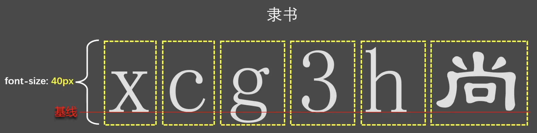
-
vertical-aligncannot control block element such asdiv. -
In the font design, characters will not be set right middle of the line; it will be a little bit downwards.
9/12/2023 Updated:
inlinesuch as<span>andinline-blockelements can be set like a text, which means we can use text attributes such astext-alignin their parents elements’ style to adjust their positions or other attributes.
Attention in line-height
- If
line-heightis too small, words will be overlapped; the minimum ofline-heightis0. line-heightcan be inherited, and it is better to writenumberas its value.- Relation between
line-heightandheight- When setup
height, the<div>container has sameheightvalue. - If we did not setup
height, then the browser will calculate the height value based on theline-height.
- When setup
Apply line-height
- For multiple line text: control the distance between lines.
- For single line text: let
heightequalsline-heightto make the font become vertical center alignment.- This is not the absolute vertical center alignment because of the fonts design.
CSS List Attributes
list-style-type:the type of the list signnonesquarediscdecimallower-romanupper-romanlower-alphaupper-alpha
list-style-position:the position of the list signinsideoutside
list-style-image:customized list sign imageurl("xxx.gif")
list:the compound attribute
CSS Table Attributes
Border
border-width:the width of borderborder-color:the color of the borderborder-style:the style of the bordernonesoliddasheddotteddouble
border:the compound attribute
Other elements can also use these attributes.
Table
The following attributes are only used in table.
table-layout:auto:automatically calculate the width by contentfixed:fixed average width
border-spacing:Only works whenborder-collapseisseparate.border-collapse:collapseseparate
empty-cells:Only works whenborder-collapseisseparateshowhide
caption-side:the position of captiontopbottom
CSS Background Attributes
background-color:the color of the background- the default is
transparent
- the default is
background-image:the background image pathurl("xxx.gif")
background-repeat:if the background is repeated or not.repeatno-repeatrepeat-xrepeat-y
background-position:the position of the background- Horizontal
leftcenterright
- Vertical
topcenterbottom
- Horizontal
background:the composite attribute
-
If only one value is written, another value will be
center. -
xandyare also acceptable; if one value only is written, it will be regarded asx, andywill be center.
CSS Mouse Attributes
cursor:the style of the cursurpointermovetextcrosshairwaithelp- …
cursor: url("./arrow.png"),pointer; |
CSS the Box Model
CSS Length Unit
pxem:it is based onfont-sizerem:it is based on<html>font-szie%:it is based on parental elementfont-size
(actually it based on the type of attribute. Check details below)
Different Attributes Different Percentage Meaning
In css, we have to set the length unit after the value we set, or it will be invalid.
CSS Element Display Modes
Block
- It will occupy one whole line.
default width:the width of parental element.default height:the height of content.- CSS can adjust
widthandheight.
- Main Structure Tags:
<html>,<body> - Format Tags:
<h1>-<h6>,<hr>,<p>,<pre>,<div> - List Tags:
<ul>,<ol>,<li>,<dl>,<dt>,<dd> - Table Related Tags:
<table>,<tbody>,<thead>,<tfoot>,<tr>,<caption> <form>and<option>
Inline
- It will not occupy an one whole line.
default width:the width of content.default height:the height of content.- CSS cannot adjust
widthandheight.
- Text Tag:
<br>,<em>,<strong>,<sup>,<sub>,<del>,<ins> <a>and<label>
Inline-Block
- It will not occupy one whole line.
default width:the width of content.default height:the height of content.- CSS can adjust
widthandheight.
- Image:
<img> - Cell:
<td>,<th> - Form Elements:
<input>,<textarea>,<select>,<button> - Frame Tag:
<iframe>
Change Element Display Mode
display: Use this attribute to change the element display mode
none:the element will be hidden.blockinlineinline-block
Consists of Box Model
CSS will regard all html elements as a box, and all styles are based on the box.
margin:it will only influence the position of the box instead of the size of the boxborderpaddingcontent
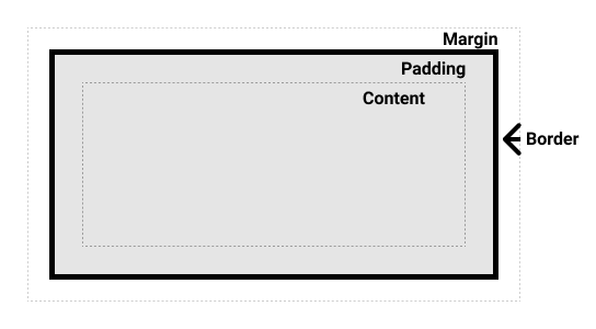
width/height of box =
width/height of content +
left right/top Bottom padding +
left right/top Bottom border
Content
width:the width of the content areamax-width:the maximum width of the content areamin-width:the minimum width of the content areaheight:the height of the content areamax-height:the maximum height of the content areamin-height:the minimum height of the content area
-
max-widthandmin-widthusually are not used withwidthtogether. -
max-heightandmin-heightusually are not used withheighttogether.
-
the total width= parentalcontent− selfmargin. -
the content width= parentalcontent− selfmargin− selfborder− selfpadding.
Padding
-
padding-top -
padding-right -
padding-bottom -
padding-left -
padding:Composite Attributepadding: 10px;padding on all directions is 10px.padding: 10px 20px;padding ontop/bottomis 10px, onleft/rightis 20px.padding: 10px 20px 30px;padding ontopis 10px, onleft/rightis 20px, onbottomis 30px.padding: 10px 20px 30px 40px;padding ontopis 10px, onrightis 20px, onbottomis 30px, onleftis 40px.
- The value of
paddingcannot be negative. - The padding of
inlineelement ontop/bottomcannot be set perfectly. - The padding of
blockandinline-blockon ALL directions will be perfectly set.
Border
border-style:nonesoliddasheddotteddouble- …
border-widthborder-colorborder:the composite attribute
We can also decide the the direction of the border. For example,
border-left: the composite attribute
border-left-styleborder-left-widthborder-left-color
Margin
General
margin-leftmargin-rightmargin-topmargin-bottommargin:the composite attribute
- Descendants’
marginis based on parentalcontentsince parentalcontentinclude descendants. - Changing
margin top/leftwill change the position of the element self, but changingmargin bottom/rightwill change the position of the adjacent elements. blockandinline-blockcan perfectly set up ALL directions ofmargin, butinlinecannot perfectly set uptop/bottomofmargin.- The value of
margincan beauto. If ablockelement is setleft/right marginasauto, theblockwill becenter. - The value of
margincan be negative.
Margin Collapse
The first child element’s top margin will be applied to its parental element’s top margin, and the last child element’s bottom margin will be applied to its parental element’s bottom margin.
Solution 1:Set parental element’spaddingwith non-zero value.Solution 2:Set parental element’sborder-widthwith non-zero value.Solution 3:Addoverflow: hiddeninto parental element css style.
Margin Merging
The upper element’s bottom margin will be merged with the lower element’s top margin; then we will choose the bigger value from them.
CSS Overflow
overflow: the way to deal with overflow content.
visible:default value; show everything.hidden:hide contentscroll:show scroll bar all the timeauto:only show scroll bar when content overflows.
CSS Methods of Hiding Elements
visibilityshowhide:the element will be invisible but the space is taken still.
displaynone:the element will be hidden without taking any space.
CSS Styles Heritage
Some styles from parental elements can be inherited by the child element. If child element has that style, it will use self one first; but if it doesn’t have one, it will look at its parental element, then ancestor elements level by level.
font,text(exceptvertical-align),text-colorcan be inherited.border,background,padding,margin,width/height,overflowcannot be inherited.
Rule 1: Those attributes that can be inherited are all no influences on layout, which means that are unrelated with box model.
Rule 2: The default style of elements such as <h1>, <a>, and <p> have higher priority than the style getting heritage. For example, body has default style that margin: 8px;
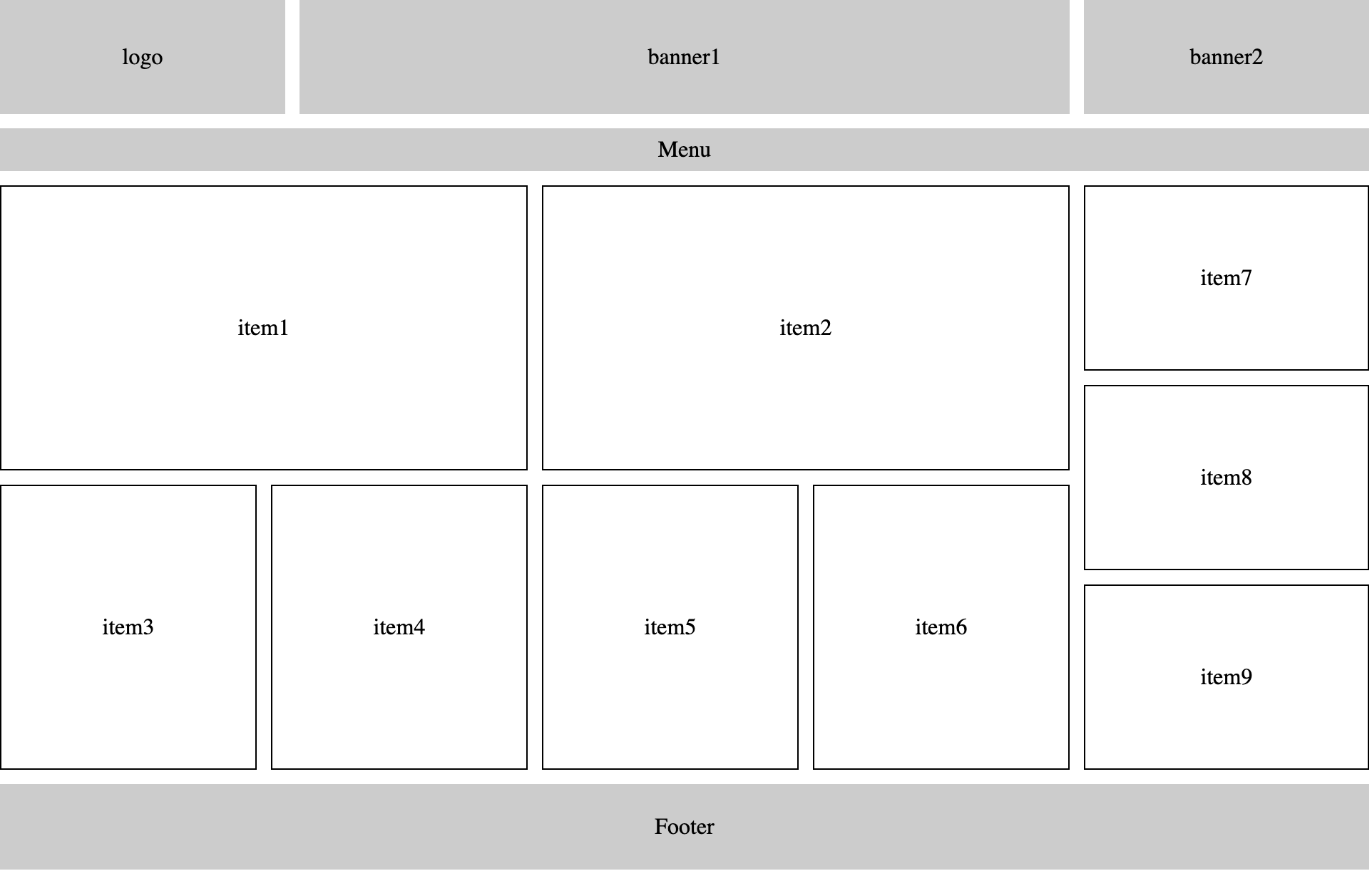
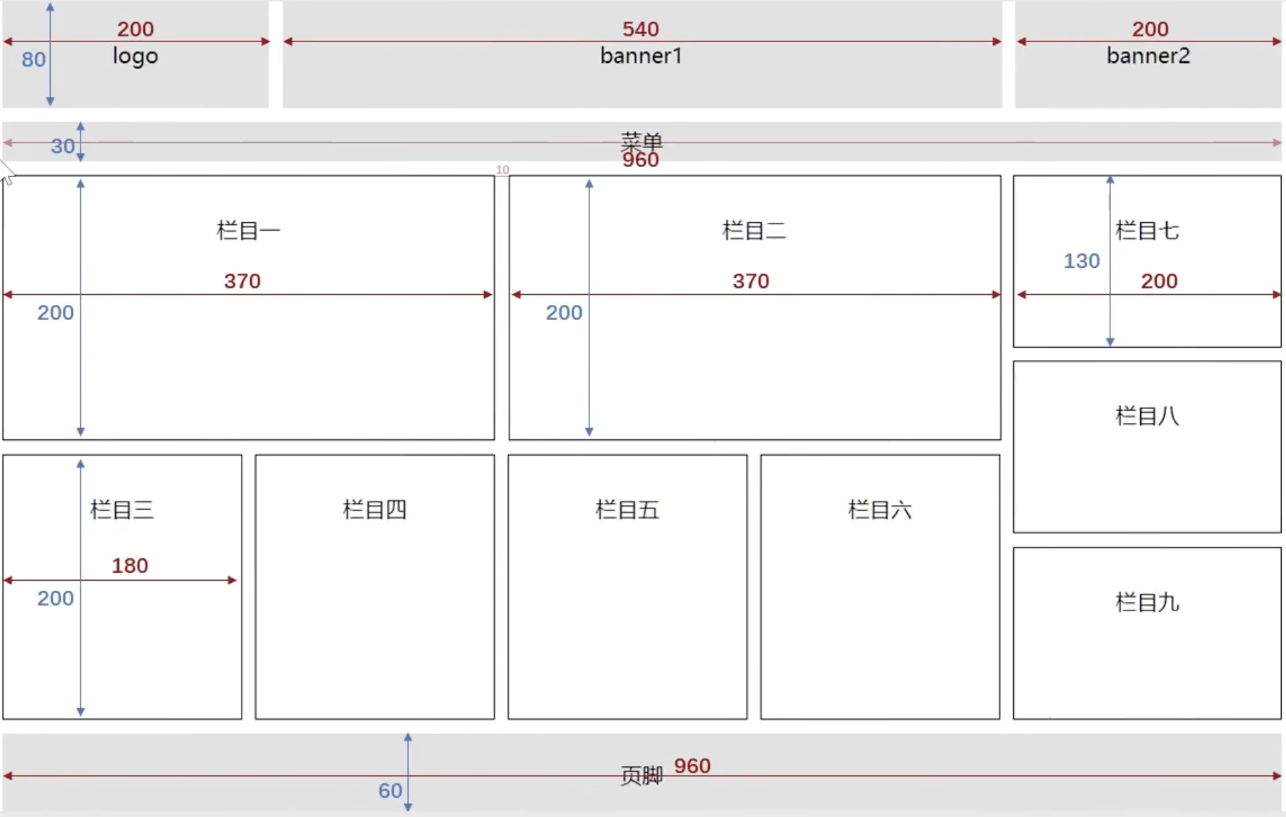
Layout Practices
Practice 1
|
Practice 2
|
Practice 3
|
Issue: two inline or inline-block will have a space between each other because there is a <return> between them in source code.
- Write them on the same line.
- The real reason is because the parental element
font-sizeis not0pxso that the space will be displayed.- Set parental element
font-size: 0px;and it will cause the children elements inherit the attribute so that these elements will not be displayed. - Add
font-sizeattribute in children elements and everything works.
- Set parental element
Blank Issues
Blank Between Elements
Reason:The newline betweeninlineandinline-blockwill be resolved as a space character by browser.Solution:- Remove newline or space. (Not Recommand)
- Set
font-size: 0in parent element. (Recommand)
Blank Between inline or inline-block
Reason:inline-blockis aligned with text baseline by default; however, there is a distance between the baseline and bottom of container.Solutions:- Set
vertical-alignasmiddle,bottom,topininline-block. - If parent element only has one image, then set the image as
display: block;. - Set
font-size: 0in parent element.
- Set
CSS Float
General
Float is used for implementing the effect that the words surround image at the beginning, but it becomes a popular way to do layout.
Characteristics
- Real FLOATING. Not a flat document layout.
- No matter which element it is before
float, after floating the default width and height of the element will be the content, and programmer can set width and height. - It will not occupy whole line; it may use same line with other elements.
- It will not have [margin merging](#Margin Merging), and it will not have [margin collapse](#Margin Collapse); at the same time, it can perfectly set up ALL directions of
marginandpadding. - It will not be treated as text like
inline-block(so that there is no [Blank Issues](#Blank Issues)).
Impacts
- Influence on sibling elements: the sibling elements behind the
floatelement will occupy the previous position that thefloatelement stayed, and it will be below thefloatelement; there is no influence on previous siblings. - Influence on the parent element: It cannot support the height of the parent element which will make the parent element be collapsed (because it is FLOATING:) However, the
widthof the parent element will still limit thefloatelement.
Eliminating the Influence of Float
-
Set
heightof parent element to support its height. -
Set
floaton parent element to lead its children elements again. -
Set
overflow:hiddenon the parent element. -
Add a
blockelement behind the lastfloatelement, and set theblockelement withclear:both. -
Set
pseudo-elementon parent element to clear the impacts..parent::after {
content: "";
display: block;
clear: both;
}
Practice
|
CSS Positions
Relative
General
-
Use
position: relativeto make the element follow the rule of position. -
Adjust
left,right,top,bottomto modify the position. -
The adjustment refers to the original position of the element.
Characteristics
- It will not get rid of the document flow, and the position change is just visually expressed, which will not have impact on other elements.
- Position element has higher priority than normal elements.
- Position element will be definately over other normal elements.
- If there are two more elements turning on position mode, the latter position element will override the former position element.
leftcannot set withright, andtopcannot set withbottomtogether.- Relative position element can use
floatandmargin, but it is not recommanded to use them.
- In most cases,
relative positionwill be used withabsolute position. relative position elementis not the concept ofposition elementtalked in theabsolutepart.
Absolute
General
- Use
position: absolute - Use
left,right,top,bottomto adjust position. - The adjustment refers to its containing block.
What is containing block?
- For those elements which did not get rid of document flow: containing block is its parent element.
- For those elements which got rid of document flow: containing block is the ancestor element who has position attribute.
Characteristics
- It will get rid of document flow, and it will have influence on its sibling and parent elements behind.
leftandrightcannot be set together.topandbottomcannot be set together.floatcannot be set withposition: absolute; if set at the same time,floatwill be invalid.margincan be set together withposition: absolutebut it is not recommanded.- No matter which size of elements, after setting with absolute position, they all become
position element.
position element: default width and height will be supported by content, and can be set height and width.
Fixed
General
- Use
position: fixed - Use
left,right,top,bottomto adjust position. - The adjustment refers to its view port.
Characteristics
- It will get rid of the document flow, and it will have influence on its sibling and parent elements behind.
leftandrightcannot be set together.topandbottomcannot be set together.floatcannot be set withposition: fixed; if set at the same time,floatwill be invalid.margincan be set together withposition: fixedbut it is not recommanded.- No matter which size of elements, after setting with fixed position, they all become
position element.
Sticky
General
- Use
position: sticky - Use
left,right,top,bottomto adjust position, andtopis frequently used. - The adjustment refers to the ancestor element which has scrolling mechanism.
overflowishidden、scroll、autooroverlay.
Characteristics
-
It will not get rid of document flow, it is a specific method for the position element under the case of scrolling window.
-
Sticky position element can use
floatandmargin, but it is not recommanded to use them. -
Sticky position and Relative position are similar, but sticky position will fix the element when it arrives at a position.
Hierarchy
Position Elementhas higher hierarchy than normal elements; ALLPosition Elementshave same hierarchy.- If two
Position Elementsoverlapped, the latter element will overlap the former one. - Modify
z-indexto adjust the hierarchy ofPosition Elements;z-indexcan only be number without unit. - Only
Position Elementscan setz-indexvalidly. - If high
z-indexvalue of a element cannot overlap the lowz-indexvalue of a element, check thez-indexvalue of its containing block.
Special Usage
- After setting
position: fixedandposition: absolute, elements will becomeposition element; its defaultheightandwidthwill be supported by its content, and we can still set theheightandwidth. - After setting
position: relative, the element is still previous display mode. - The special usage mentioned below is only for
position: absoluteandposition: fixedelement.
-
widthandheightofposition elementis filled with containing block.width:Set theleftandrightofposition elementas 0.height:Set thetopandbottomofposition elementas 0.
-
position elementis vertically aligned in the center of containing block.-
Recommended
left: 0;
right: 0;
top: 0;
bottom: 0;
margin: auto; -
left: 50%;
top: 50%;
margin-left: negative half of width;
margin-top: negative half of height;

    -   Both methods require the `position element` having `width` and `height`.


<br>

## Shopping Web Practice

Web Example: [link](/notes/frontend/css.assets/shopping-web/index.html)

Archived Package: [link](/notes/frontend/css.assets/shopping-web/shopping-web.zip)


<br>

## CSS3 Length Units

-   `vw:` Percentage of the viewport width.
-   `vh:` Percentage of the viewport height.
-   `vmax:` The maximum between `vw` and `vh`.
-   `vmin:` The minimum between `vw` and `vh`.


<br>

## CSS3 Box Attributes

### Box-sizing

`box-sizing:` Set the type of box modeling.

-   `content-box:` `width` and `height` will set the box size of **the content area**.
-   `border-box:` `width` and `height` will set the box size of **the total box area**.


### Resize

`resize` can control if it is allowed for user to adjust the size of elements.

-   `none:` Users are not allowed to modify.
-   `both:` Users can adjust `width` and `height` of the element.
-   `horizontal:` Users can adjust `width` of element.
-   `vertical:` Users can adjust `height` of element.


### Box-shadow

`box-shadow` can add shadow on boxes.

`box-shadow: h-shadow v-shadow blur spread color insert;`

-   `h-shadow:` The position of horizontal shadow **(REQUIRED)**.
-   `v-shadow:` The position of vertical shadow **(REQUIRED)**.
-   `blur:` The blur distance.
-   `spread:` The spread distance of shadow.
-   `color:` The color of shadow
-   `insert:` Change shadow type from **external** to **internal**.


### Opacity

`opacity` can add the effect of transparent. The value is from `0` to `1`; `0` is fully transparent, `1` is fully opaque.

{% note info modern %}

Difference between `opacity` and `rgba`?

1.   `opacity` is an attribute, setting the transparency of **whole element (including the content in the element)**.
2.   `rgba` is a method of color setting, and it can **only adjust color transparency**.

{% endnote %}


<br>

## CSS3 Background Attributes

### Background-origin

`background-origin:` Set the origin position of the background.

-   `padding-box:` Show background image from the `padding` area. **(DEFAULT)**
-   `border-box:` Show background image from the `border` area.
-   `content-box:` Show background image from the `content` area.


### Background-clip

`background-clip:` Set the background image clipping method.

-   `border-box:` The background image will be clipped fter `border` area. **(DEFAULT)**

-   `padding-box:` The background image will be clipped after `padding` area.
-   `content-box:` The background image will be clipped after `content` area.
-   `text:` The background image only appear on the text.

{% note info modern %}

If the value is `text`, the attribute should become `-webkit-background-clip`.

{% endnote %}


### Background-size

`background-size:` Set the size of the background

1.   Use `px` to set the size of background image. Negative number is not allowed.

     `background-size: 300px 200px;`

2.   Use `%` to set the size of background image. Negative number is not allowed.

     `background-size: 100% 100%;`

3.   `auto:` The real size of the background image. **(DEFAULT)**

     `background-size: auto;`

4.   `contain:` Proportionally zoom in or out the image until the width or height of background image is fit in with the width or height of container. **Parital area of container may not have background image**.

     `background-size: contain;`

5.   `cover:` Proportionally zoom in or out the image until the background image **fully cover the container**. **Partial area of background image may not be displayed**.

     `background-size: cover;`


### Background Compound

#### General

`background: color url repeat position / size origin clip`

{% note info modern %}

1.   If the value of `origin` and `clip` are same, they can be set together by only giving one value; But if there are two values, the former one is `origin`, and the latter one is `clip`.
2.   The value of `size` has to be written before the value of `position` by using `/` to separate them.

{% endnote %}


#### Multiple Background Images

```css
background: url(./images/bg-lt.png) no-repeat left top,
            url(./images/bg-rt.png) no-repeat right top,
            url(./images/bg-lb.png) no-repeat left bottom,
            url(./images/bg-rb.png) no-repeat right bottom,
-
background-image is not allowed to write multiple background images.
CSS3 Border Attributes
Border-radius
border-radius can set the box become circule.
border-top-left-radius:Set the top left radius. One value means circle radius, and two values mean ovalxandyradius.border-top-right-radius:Set the top right radius. One value means circle radius, and two values mean ovalxandyradius.border-bottom-left-radius:Set the bottom left radius. One value means circle radius, and two values mean ovalxandyradius.border-bottom-right-radius:Set the bottom right radius. One value means circle radius, and two values mean ovalxandyradius.
border-radius compound attribute.
border-radius: top-left-x top-right-x bottom-right-x bottom-left-x / |
Outline
outline-width:The width of the outlineoutline-color:The color of the outlineoutline-style:The style of the outlinenonedotteddashedsoliddouble
-
outlinecompound attribute.outline: 50px solid blue;
-
outline-offsetis not sub-attribute ofoutline; it is an independant attribute.
CSS3 Text Attributes
Text-shadow
text-shadow can be used for adding shadow on text.
h-shadow:The distance of horizontal shadow. It can be negative. (REQUIRED)v-shadow:The distance of vertical shadow. It can be negative. (REQUIRED)blur:The blur distance of shadow. (Optional)color:The color of shadow. (Optional)
White-space
white-space can set the method of new text line.
normal:After text overflows the border, it will have a new line; the new line in the text will be regarded asspace. (Default)pre:Keep original text structure; it is same as tagpre.pre-wrap:Based on thepre, after the text overflows the border, it will have a new line.pre-line:Based on thepre, after the text overflows the border, it will have a new line; it will only recognize the new line in text, but thespacewill be ignored.nowrap:No new line.
Text-overflow
text-overflow can set the display mode of text.
clip:When the content is overflowed, it will clip that part.ellipsis:When the content is overflowed, it will replace that part as....
In order to make text-overflow attribute valid, the block container have to NOT set overflow as visible, and white-space should be nowrap.
Text-decoration
text-decoration becomes a compound attribute in CSS 3.
text-decoration: text-decoration-line || text-decoration-style || text-decoration-color
text-decoration-line:Set the position of the decoration line.noneunderlineoverlineline-through
text-decoration-style:Set the style of the decoration line.soliddoubledotteddashedwavy
text-decoration-color:Set the color of the decoration line.
Text-stroke
text-stroke is only supported by webkit browser.
-webkit-text-stroke-width:Set the width of text stroke.-webkit-text-stroke-color:Set the color of text stroke.-webkit-text-stroke:Compound attribute to set width and color.
CSS3 Gradient
Linear-gradient
/* The direction of the linear-gradient is from up to down */ |
Radial-gradient
/* Normal */ |
Repeating-gradient
repeating-linear-gradient and repoeating-radial-gradient will make the gradient effects repeatedly.
background-image: radial-gradient(100px, red, yellow, green); |
Check here for more details.
Web Fonts
Using @font-face to indicate the address of the font will make browser download the font automatically so that the website will not depend on fonts installed on users’ computers.
/* Simple Method */ |
- Some size of language characters are huge, and it is unpractical to use complete font file; usually we will do customizations on some characters. Here is one example customization font website: https://www.iconfont.cn/webfont.
iconfontis also a good method to be applied. It is more clear than image, easier to do adjustments, and great compatibility withIE. Here is one example iconfont website: https://www.iconfont.cn.
CSS3 Transform 2D
All transformations will be written into the attribute transform. Example below:
transform: translateX(10px) rotateZ(32deg);
Translate
translateX:Set the translation on the horizontal direction. If the value is percentage, it refers to its own width percentage.translateY:Set the translation on the vertical direction. If the value is percentage, it refers to its own width percentage.translate:Compound value for horizontal and vertical.
-
translateandposition: relativeis similar that they do not get rid of document flow which will not influence other elements. -
Difference between
translateandposition: relative:position: relativerefers to its parent element when the element value is percentage;translaterefers to itself when the element value is percentage. -
Browser is more efficient on
translateinstead ofposition: relative. -
translatecan be written in chain.transform: translateX(30px) translateY(40px); -
translatecannot be set oninlineelements. -
Using
translateandposition: relativecan realize element horizontal and vertical aligned..box {
position: absolute;
left: 50%;
top: 50%;
transform: translate(-50%, -50%);
}
Scale
scaleX:Set the scale horizontally;1means no change in scale.scaleY:Set the scale vertically;1means no change in scale.scale:Set the scale horizontally and vertically; one value can set both or two values set repectively.
scalesupports negative but has less usage.scalecan make the font smaller than12px. (The default minimum font in most of browser is12px).
Rotate
rotate:Set the rotation degree; positive value is clock-wise, and negative value is counter clock-wise.
rotateZ(20deg) is equal to rotate(20deg). But after we are in 3D transformation, we can write rotate(x,x,x).
Skew
skewX:Set the element skew on the horizontal direction.skewY:Set the element skew on the vertical direction.skew:One value meansskewX, two value meanskewXandskewY.
Transform-orgin
- When the element transforms, the default origin is the center of the element.
transform-origincan set the origin. - Modifying origin will have no influences on
translatebut have impacts onrotateandscale. - If only provide two values, the first one is used for horizontal coordinate, and the second one is for vertical coordinate.
- If only one is provided and it is a
px, then it means horizontal coordinate and the vertical coordinate will be50%; if it is keyword such asleftortop, then another one will be50%.
transform-origin: 50% 50%will change the origin into the center position of the element since percentage refers to itself. (Default)transform-origin: left topwill change the origin into the left-top corner.transform-origin: 50px 50pxwill change the origin into the position that is50px 50pxaway from left-top corner.transform-origin: 0, if one value is given, the second one will be50%by default.
CSS3 Transform 3D
General
Open 3D Space
Before we do 3D transformation, the parent element needs to open 3D space.
transform-style: flat;It will make the child elements stay at2Dspace. (Default)transform-style: preserve-3d;It will make the child elements stay at3Dspace.
Set Up Depth of Field
Depth of field is the distance between observer and z=0 platform, which will make the element that can be 3D transformed obviously.
perspective: noneDefault value that withoutdepth of field.perspective: {length}set the distance between observer andz=0platform. Negative value is not allowed.
perspective should be set in the parent element.
Perspective-origin
The origin of perspective is the position of the observer; also, the default perspective origin is the center of the element.
/* The relative coordinate will be rightward to 400px and downward to 300px. */ |
Translate
3D translation is based on 2D translation, which let element moves along coordinate z.
translateZ:Set the displacement of the element on coordinatez; the positive value is going out of screen, and the negative value is going inside of the screen.%is not allowed.translate3d:First parameter is coordinatex, the second parameter is coordinatey, and third parameter is coordinatez. All parameters cannot be omitted.
Rotate
3D rotation is based on 2D rotation, which let elements rotate along coordinate x and y.
-
rotateX:Set the rotate degree of coordinatex. Positive value is clock-wise; negtive value is counter clock-wise. -
rotateY:Set the rotate degree of coordinatey. Positive value is clock-wise; negtive value is counter clock-wise. -
rotate3d:First 3 parameters meanx, y, z. The forth parameter means rotation degree.
Scale
3D scale is based on 2D scale, which can make element scaled along coordinate z.
scaleZ:Set proportion on the coordinatez.scale3d:First parameter is coordinatex, second parameter is coordinatey, and third parameter is coordinatez. All parameters cannot be omitted.
CSS3 Transition
-
transition-property:Define which attribute will need transition.none:None of attributes.all:All of attributes that can be transited.{specific attribute name}:width,height.
Not all of attributes can be transited; only the attributes whose value is number or the value that can be changed to numbers such as
color,length,%,z-index,opacity,2D transform,3D transform,shadow. -
transition-duration:Define the duration of the transition.0:No transition time.s/ms:second or miliseond.list:- One Value: All attributes have same duration value.
- List of Values: All attributes have their own duration value.
-
transition-delay:Define the delay time,sorms -
transition-timing-function:Set the type of transitionease:Smooth transition.linear:Linear transition.ease-in:slow -> fast.ease-out:fast -> slowease-in-out:slow -> fast -> slowstep-start:Equals tosteps(1, start).step-end:Equals tosteps(1, end).steps({integer}, ?):Accept two parameters. First parameter is positive integer to define the steps of function. The second parameter can bestartorendto indicate the timing to change.endis Default.cubic-bezie({number}, {number}, {number}):Define the motivation. Here is the website for more details.
transition compound attribute:
transition: 1s 1s linear all;
If there is one time set, that means duration. If there are two time set, the first one is duration, the second one is delay. Other values’ order is not required.
CSS3 Animation
Usage
/* Method 1 */ |
/* Method 2 */ |
animation-name:Indicate which animation we will use on the element.animation-duration:Indicate the duration of animation.animation-delay:Indicate the deplay of animation.
.box { |
Other Usages
animation-timing-function:Set the type of animation. The value is listed [here](#CSS3 Transition) which is same as Transition.animation-iteration-count:Set the repeating numbers.{number}:The number of repeating times.infinite:Infinately repeat animation.
animation-direction:Set the animation playing directionnormalreversealternate:The animation will be played alternatively in different two perspectives.alternate-reverse:Reversed alternate animation.
animation-fill-mode:Set the animation statusforwards:Set the object status when the animation ends. It means the animation paused at the end.backwards:Set the object status when the animation starts. It means the animation paused at the start.
animation-play-state:Set the animation playing status. It is used individually in common cases.runningpaused
Compound attribute animation
animation: atguigu 3s 0.5s linear 2 alternate-reverse forwards;
One value of time is duration, two value of time are duration and delay. Other attributes’ order is not required.
CSS3 Multi-column Layout
-
column-count:Indicate the number of columns. -
column-width:Indicate the width of each column. -
columns:Setwidthandcountat the same time. -
column-gap:Set the gap between columns. -
column-rule-style:Set the border style between columns; the value is same asborder-style. -
column-rule-width:Set the border width between columns. -
column-rule-color:Set the border color between columns. -
column-rule:Compound attribute can set column border. -
column-span:Indicate if the one will need to occupy whole line.noneall